I learned the hard way that picking cabinet colors from tiny paint swatches can go very wrong. A warm gray I loved in-store turned purple under my kitchen lighting. Since then, I’ve paid attention to how successful kitchen remodel color combinations balance light, texture, hardware, and mood together instead of treating each finish separately.
The best kitchens do not rely on one trendy shade. They combine tones that create contrast, depth, and flow without making the room feel busy. That balance matters even more in open-concept homes where kitchens blend into dining and living spaces.
Why Color Pairing Matters More Than Individual Colors
A beautiful cabinet color can still fail when paired with the wrong countertop or flooring. I noticed this during a showroom tour where six kitchens used the same white quartz. Only two looked expensive because the cabinet undertones matched the surface correctly.
How Lighting Changes Cabinet Colors
Natural light changes everything. North-facing kitchens often make whites look cooler and grays appear blue. South-facing rooms warm up beige, taupe, and cream tones.
Warm LED bulbs can also distort paint. I always recommend testing samples morning and night before committing.
According to the U.S. Department of Energy, lighting color temperature significantly affects perceived interior color appearance.
The 60-30-10 Rule Designers Still Use
Most successful kitchen remodel color combinations follow a visual ratio:
- 60% dominant color
- 30% secondary tone
- 10% accent finish
That usually means cabinetry dominates, countertops support, and hardware provides contrast.
Quick Reference Table for Kitchen Color Combinations
| Style | Main Colors | Best Hardware | Overall Feel |
| Organic Earthy | Sage + White Oak | Antique Brass | Warm and grounded |
| Coastal Modern | Powder Blue + White | Champagne Bronze | Bright and relaxed |
| Nordic Minimalist | Blonde Wood + Soft White | Matte Black | Clean and airy |
| Moody Luxury | Emerald + Brass | Satin Brass | Dramatic and rich |
| Contemporary Neutral | Cashmere Gray + Walnut | Oil-Rubbed Bronze | Sophisticated warmth |
| High Contrast | Navy + White | Brushed Gold | Timeless and bold |
Organic and Earthy Kitchen Color Combinations
Earth-inspired kitchens continue dominating remodel trends because they feel calming without looking sterile.
Sage Green and White Oak
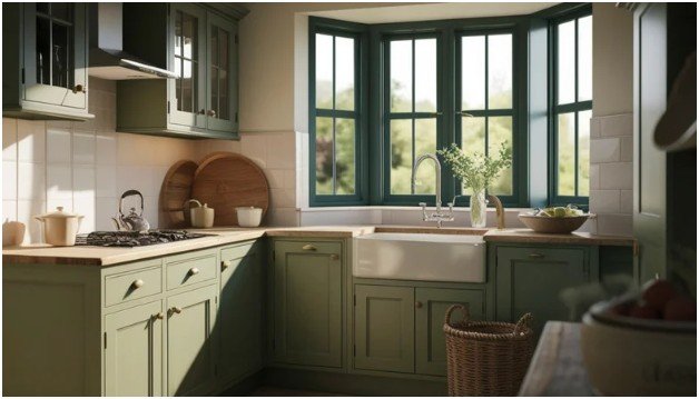
This combination works because it feels natural without becoming rustic. Sage cabinets soften the space while white oak prevents the room from feeling cold.
I recently saw this pairing under matte black pendants, and it instantly felt custom-built. The warmth of the wood balanced the cool green perfectly.
Use creamy quartz instead of bright white counters here. Pure white often clashes with earthy tones.
Terracotta and Cream
Terracotta kitchens are finally replacing the all-gray trend. The color creates warmth without overpowering the room.
Cream backsplashes and soft stone counters help keep terracotta from feeling too heavy. I also noticed brushed brass hardware elevates the palette immediately.
This pairing works especially well with natural limestone-look flooring.
Pale Eucalyptus and Linen
Muted eucalyptus green feels softer than sage. It creates a spa-like atmosphere when combined with warm beige walls and textured ceramic tile.
This palette pairs beautifully with many minimalist kitchen remodel ideas because it keeps visual clutter low while still adding personality.
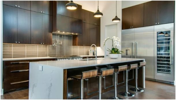
Modern High-Contrast Kitchen Color Combinations
Contrast adds depth and sharpness to kitchens that otherwise feel flat.
Navy Blue and Crisp White
This remains one of the safest two-tone combinations for resale appeal.
Deep navy lower cabinets ground the room while bright white uppers keep the space open. I recommend using brushed gold hardware instead of chrome if you want the kitchen to feel less corporate.
Quartz countertops with faint gray movement complete the look.
Charcoal and Veined Marble
Dark charcoal cabinetry creates dramatic contrast against white marble surfaces.
The key is balance. Too much charcoal absorbs light quickly. That is why I prefer using darker tones only on perimeter cabinets while keeping the island lighter.
Large slab backsplashes also make this combination feel more seamless and luxurious.
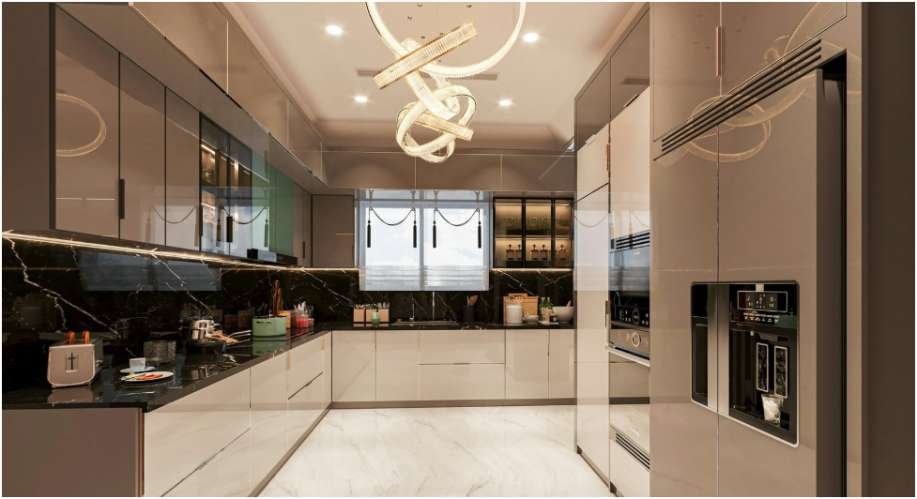
Emerald Green and Brass
Emerald green kitchens photograph beautifully, but they need restraint in real life.
The best version I saw paired deep green millwork with unlacquered brass and creamy plaster walls. The aged brass softened the richness of the green over time.
This combination works best in kitchens with strong natural light.
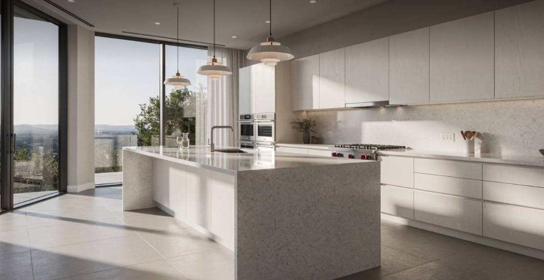
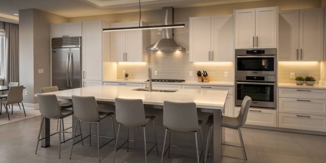
Bright and Airy Kitchen Remodel Color Combinations
Bright kitchens continue outperforming dark spaces in buyer preference surveys from the National Association of Home Builders.
Blonde Wood and Soft White
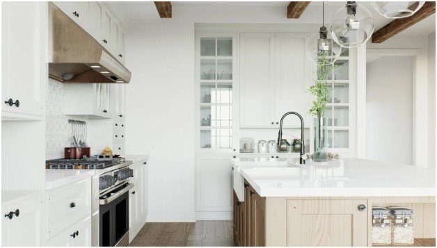
This Nordic-inspired look makes small kitchens feel larger.
Flat-panel white oak cabinets paired with matte white uppers create clean lines without visual heaviness. I especially love this look with vertical stacked tile because it draws the eye upward.
Touch-latch cabinets also help maintain the minimalist feel.
Chalk Gray and Bright Alabaster
Soft gray kitchens feel more architectural than standard white kitchens.
I tested this palette under cool and warm lighting. Unlike darker grays, chalk tones stayed consistent throughout the day.
Light terrazzo or polished concrete counters complete the modern aesthetic beautifully.
Sky Blue and Matte Chalk
Muted powder blue islands add subtle personality without overwhelming the room.
I noticed this works best when perimeter cabinets remain bright white. Too much blue can quickly date the space.
Back-painted glass backsplashes reflect light exceptionally well in smaller kitchens.
Warm Contemporary Kitchen Color Trends
Warm neutrals are replacing icy grays in many remodels.
Cashmere Gray and Walnut
Cashmere gray sits between beige and mushroom tones. It feels softer than traditional cool gray cabinetry.
Dark walnut accents create contrast while maintaining warmth. I recommend integrated hardware here for a smoother appearance.
Taupe and Matte Black
Taupe kitchens look surprisingly modern when paired with black fixtures and slim-frame lighting.
This combination works best with textured finishes rather than glossy cabinetry.
Teal and Dusty Pink
This pairing sounds risky, but muted versions can look incredibly stylish.
Dusty pink walls soften deep teal islands while copper hardware adds warmth. I would only use this palette in homes with strong natural light and modern architecture.
Hardware and Countertop Pairings That Change Everything
Hardware often decides whether a kitchen feels modern, farmhouse, or luxury-inspired.
Here is what consistently works best:
- Matte black creates crisp contrast
- Brushed brass adds warmth
- Satin nickel feels timeless
- Oil-rubbed bronze suits earthy palettes
- Integrated pulls create minimalist appeal
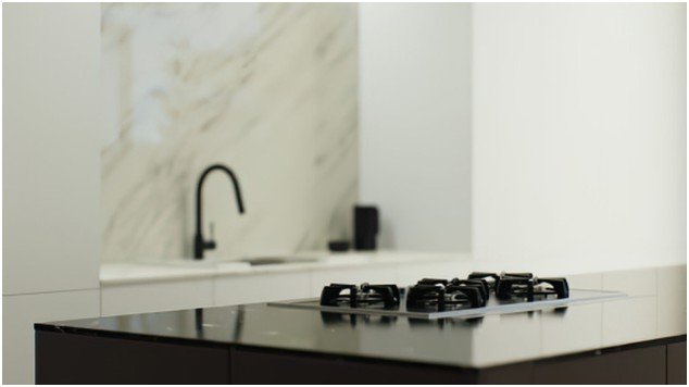
Countertops matter equally. I prefer subtle quartz veining over dramatic patterns because bold slabs compete with cabinet colors too aggressively.
According to the National Kitchen and Bath Association, quartz remains one of the most requested countertop materials due to durability and lower maintenance.
Kitchen Color Mistakes I Would Never Repeat
The biggest mistake is choosing trendy colors without testing them under real lighting.
I also avoid:
- Matching upper and lower cabinets exactly
- Overusing cool gray tones
- Combining warm woods with icy whites
- Choosing busy countertops and patterned backsplashes together
- Ignoring flooring undertones
One showroom designer told me something that stuck: “The best kitchens feel layered, not color-matched.”
That advice changed how I evaluate remodel palettes.
FAQs
1. What are the best kitchen remodel color combinations for resale?
White and navy, sage and oak, or warm gray and walnut remain strong choices because they feel timeless without looking boring.
2. Are two-tone kitchens still popular?
Yes. Two-tone kitchens continue trending because they add depth and help large kitchens feel less flat.
3. What cabinet color makes kitchens look bigger?
Soft white, pale gray, and light wood finishes reflect more light and create an open appearance.
4. Should countertops match cabinets?
Not exactly. Slight contrast creates dimension and prevents the kitchen from looking overly uniform.
5. What hardware works with most kitchen remodel color combinations?
Brushed brass, matte black, and satin nickel remain the most versatile finishes across modern kitchen styles.
Your Kitchen Called — It Wants Personality Back
The kitchens I remember most never played it safe with plain builder-grade color choices. They layered warmth, contrast, texture, and lighting intentionally. That is what makes a remodel feel custom instead of copied from a catalog.
Before committing to any palette, test samples during different times of day. Paint shifts constantly under changing light. A combination that looks perfect online may feel completely different in your actual space.
The smartest remodel decisions happen after the samples hit the wall.